

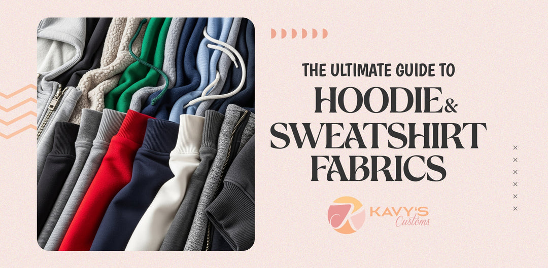
How to Pick Apparel Colors That Reflect Your Brand

Walking into a corporate organization where all employees are wearing mismatched, faded t-shirts. Would you trust them to serve a premium latte? Probably not. Now, picture another where the team is dressed in crisp, stylish uniforms that scream, "We’ve got our act together!" Instantly, your confidence rises. That’s the power of color in branding.
For business owners, non-profits, and schools looking to create cohesive apparel, choosing the right colors enhances aesthetics and conveys the right message. Whether you need custom embroidered uniforms or high-quality direct-to-film (DTF) printed apparel, the right color choices can make or break your brand identity. Let’s break down how to do it right.
Why Apparel Colors Are Key to Your Brand Identity

Colors are a silent language. They speak volumes before a word is ever exchanged. In branding, colors evoke emotions, define personality, and differentiate you from competitors.
-
First Impressions Matter: ColorCom reveals that 92.6% of a customer’s initial judgment is based on color alone. If your apparel is off-brand or visually dull, potential customers might make snap (and unfavorable) judgments.
-
Creates Brand Recognition: Think of McDonald’s red and yellow or Tiffany’s iconic blue. Even without a logo, you recognize the brand instantly.
-
Boosts Employee and Customer Connection: A well-designed uniform makes employees feel part of something bigger, boosting morale. It also reassures customers that they’re engaging with a professional brand.
Understanding the Psychology of Colors

Douglas Berger stated that well-planned color selections can define a brand’s identity, elicit emotions, and impact consumer buying behavior. Choosing colors means selecting hues that align with your brand’s personality. Here’s a breakdown:
-
Warm Colors:
-
Red: Passion, urgency, excitement (great for brands wanting to stand out).
-
Orange: Creativity, enthusiasm, energy (ideal for innovative, youthful brands).
-
Yellow: Optimism, friendliness, clarity (popular with customer-centric businesses).
-
Cool Colors:
-
Blue: Trust, reliability, professionalism (widely used by banks, tech, and corporate brands).
-
Green: Growth, eco-friendliness, balance (perfect for sustainable brands and schools).
-
Purple: Luxury, creativity, wisdom (commonly associated with premium products).
-
Neutral Colors:
-
Black: Sophistication, strength, elegance (high-end businesses love black uniforms).
-
White: Cleanliness, simplicity, minimalism (often used in medical and wellness sectors).
-
Gray: Modernity, professionalism, subtlety (a versatile color that pairs well with others).
Aligning Apparel Colors With Your Audience
It’s tempting to pick colors based on personal preference but remember: your apparel represents your customers, employees, and students—not just you. Consider:
-
Business Owners & Retail Consumers: They want professional-looking, high-quality uniforms. If your brand values reliability and trust, blue might be the way to go. If creativity is key, an energetic orange could work.
-
Non-Profits & Event Organizers: Custom short or long T-shirts for fundraising events should stand out! Bright colors like yellow and green evoke energy and positivity.
-
Schools & Academic Institutions: School apparel needs to reflect school spirit. Bold colors like red, navy, or green help reinforce team identity.
Creating a Cohesive Brand Color Palette
A brand palette represents more than one color—it’s a strategic mix of shades that work together. Follow these steps:
-
Select a Primary Color – The dominant shade representing your brand’s core identity.
-
Choose Complementary Colors – Use a color wheel to find hues that enhance your primary color.
-
Add a Neutral Base – Incorporate black, white, gray, or beige for balance.
For instance, an eco-friendly clothing brand might use green (nature), brown (earth), and white (freshness). A luxury corporate brand might opt for navy blue (trust), gold (prestige), and gray (modernity).
Matching Apparel Colors to Your Existing Brand Palette
If your business or organization already has a logo and color scheme, ensure your apparel complements it. A neon pink t-shirt for a brand that’s all about calm blue tones? Big mistake. Keep it consistent.
Also, consider the material:
-
DTF printing works best on dark and vibrant colors.
-
Embroidery shines on solid, smooth fabrics like polos and jackets.
-
Avoid colors that fade quickly or don’t hold embroidery well (light pastels on fleece can be tricky).
Choosing the Right Color Combinations for Maximum Impact

Your apparel should be eye-catching but not overwhelming. Avoid clashing shades. Instead, try:
-
High-contrast pairings: Black and white (bold and classic)
-
Monochromatic themes: Navy, sky blue, and teal (professional yet stylish)
-
Analogous colors: Green, yellow-green, and lime (fresh and youthful)
Practical Tips for Testing and Refining Color Choices
Before mass-producing apparel, test your colors:
-
Create Digital Mockups – Preview how colors look together.
-
Print Samples – Colors on fabric can differ from digital designs.
-
Get Feedback – Ask employees or customers what looks best.
-
Check for Readability – Ensure logos/text contrast well against fabric colors.
Stand Out While Staying True to Your Industry
While it’s great to be unique, don’t stray too far from industry expectations. A law firm in neon green uniforms? Maybe not. A fitness brand in sleek black and electric blue? Perfect.
Maintaining Color Consistency Across All Brand Touchpoints
Once you’ve chosen colors, stick with them. Keep consistency across:
-
Apparel
-
Marketing materials
-
Business cards & packaging
-
Digital branding (website, social media)
Use standardized color codes (Pantone, CMYK, or RGB) to ensure uniformity across all platforms.
Conclusion
Choosing apparel colors reinforces trust, recognition, and unity. Whether you’re a business owner, non-profit organizer, or school administrator, the right color choices will set you apart.
At the end of the day, a great uniform is like a superhero costume, it makes people feel confident, united, and professional. And if you want that perfect blend of high-end embroidery or premium DTF-printed apparel, Kavy’s Customs is where quality meets brand identity.
Ready to make a statement? Choose your colors wisely, and let your apparel do the talking!

Leave a comment